
The Boston Red Sox have just eliminated the Yankees from this year’s postseason.
Boston sport fans, read it again and again. Few sentences will bring you greater joy.
It is, therefore, unsurprising that articles relating to last night’s triumph dominate Boston.com’s homepage, as you can see below.

While I agree that the victory is newsworthy and deserves a lot of attention, I am not such a fan of the way in which the five separate Red Sox articles are almost scattered around the site amongst non-sporting news. I think that, when you have several sports articles published in one morning, they are best left in one section. Sports fans will still read them and non-sports fans do not have to navigate through an ocean of Red Sox analysis to find their news.
One thing I do love about the Boston.com website is the way they highlight each article’s specific topic in red above the headline. Those having a quick scan of the website, perhaps to lazy to read each headline individually, can be grabbed by a topic they’re interested in. However, why they haven’t written ‘Colin Kaepernick’ rather than ‘NFL’ on the fifth article down is a mystery to me. Articles on Kaepernick draw an audience that stories on the sport alone do not, and they should have capitalized upon this.
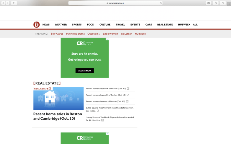
One thing that bugs me about the Boston.com website is the amount of advertising. There is an advert that takes up the entire page between each section. If the sections were longer, I would be more understanding, but each one contains a flimsy five or six articles. Surely this could be easily solved by moving the advertisements to the side of the page, which right now is completely blank.
