

My third newstrack blog comes in the wake of another stellar week for news. Including, notably, yesterday’s midterm elections.
Things turned out largley as expected in Massachusetts, with victories for Gov. Baker, Sen. Warren, No on Question One and Yes on Questions Two and Three.
For news agencies, elections are a perfect time to add a little flair to news coverage. The public are sifting through a massive amount of information and there are few better ways to help them understand what is happening than with a graphic.
This week, Boston.com has failed to capitalize on this opportunity. As you can see below, the presented the majority of their information in text only:


They have essentially piled a load of information into one long text, which could have been transmitted to the reader so much more effectively if they could only add a bit of color.
The most widely read article on their page was an article displaying the election results. Despite this not appearing on the front page, it was still placed first on the top 10 most popular stories column. I was hoping to find some more color here, but again, I was left disappointed.

Clearly, not only was it a bland presentation of information, but it was also minimally informative. Surely it would have been easy for Boston.com to include the percentages by which the victorious candidates won?
Finally, I felt that they did not segregate electoral stories from everyday stories as they shoud have done. On the homepage, political stories are scattered between stories relating to sport, crime and travel, as you can see:
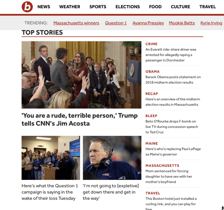
Not only that, but they failed to even create a specific section for electoral stories. On this day of all days, readers will be coming to the site to read about the election – Boston.com should be making sure that this information is all in one place.
